


|
Standard Components
|
|
 symbol to help you identify which ones you will need to understand most. As we have already mentioned you can set many options for a component in its popup menu, and henceforth we shall refer to these options as properties.
 |  Label Displays any text you care to assign to it. To add or edit text type in the edit box that appears on the toolbar when a label component is selected. Label Displays any text you care to assign to it. To add or edit text type in the edit box that appears on the toolbar when a label component is selected.
|
|
|
|
|
|
|
|
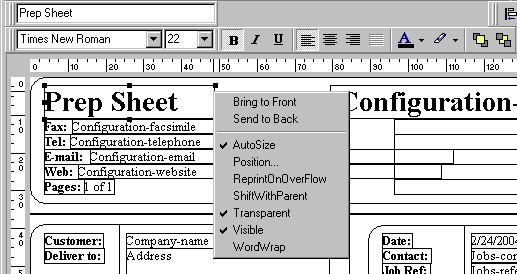
| he popup menu for a Label has an AutoSize property to automatically resize the component as the text is edited. word-wrapping is also possible, although you will have to stretch the component to make it twice as tall.
|
|  Memo Prints multiple lines of plain text in a report. To set the text choose Lines from the popup menu, and type into the mini editor which will open. To dynamically resize the Memo during printing, tick the Stretch property. Memo Prints multiple lines of plain text in a report. To set the text choose Lines from the popup menu, and type into the mini editor which will open. To dynamically resize the Memo during printing, tick the Stretch property.
|
|
|
 Rich Text Prints formatted text. Works just like a Memo except the text editor that pop up allows you to format the text as BOLD, ITALIC, etc. objects Rich Text Prints formatted text. Works just like a Memo except the text editor that pop up allows you to format the text as BOLD, ITALIC, etc. objects
|
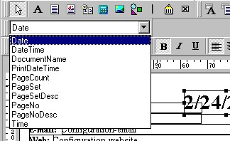
|  System Variable Displays common report information such as Page Number, Page Count, Print Date. To set the type of information the component will display pick from the drop down list that appears on the Toolbar when the component is selected. System Variable Displays common report information such as Page Number, Page Count, Print Date. To set the type of information the component will display pick from the drop down list that appears on the Toolbar when the component is selected.
|
|
|
|
|
|
 Variable This component is used for advanced techniques which are not exposed in the Report Designer for Rental Desk. Though widely used throughout all the standard reports, you do not have access to the coding area for this component. However, you CAN still set a number of properties from its popup menu, such as its visibility. Variable This component is used for advanced techniques which are not exposed in the Report Designer for Rental Desk. Though widely used throughout all the standard reports, you do not have access to the coding area for this component. However, you CAN still set a number of properties from its popup menu, such as its visibility.
|
|  Image Displays images and pictures in your report. Click the Picture property from it popup menu to invoke the search dialogue. Most common image formats are supported. Image Displays images and pictures in your report. Click the Picture property from it popup menu to invoke the search dialogue. Most common image formats are supported.
|
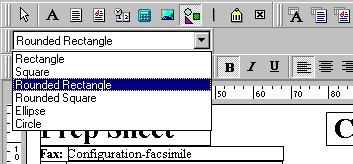
|  Shape Prints various shapes (squares, rectangles, circles,ellipses). Set which type of shape you want by selecting from the drop down control on the Toolbar Shape Prints various shapes (squares, rectangles, circles,ellipses). Set which type of shape you want by selecting from the drop down control on the Toolbar
|
|
|
|
|
|
You can then set the border style and background colours: 
|
| Note: You may need to set the "SendtoBack" property on a Shape when you drop it on the Designer canvas as it will obscure other components already there.
|
|
|
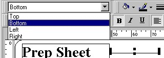
|  Line Displays single and double lines (either vertical or horizontal.) Use its popup menu to specify if the line is single or double. On the Toolbar you can set the Style of the line, e.g. dotted, dashed, etc. Most importantly you set whether the line sits on the Top, Bottom, Left, Right of the component. This will of course determine whether the line is horizontal or vertical. If setting it to be vertical you will no doubt need to re-size the height of the component. Line Displays single and double lines (either vertical or horizontal.) Use its popup menu to specify if the line is single or double. On the Toolbar you can set the Style of the line, e.g. dotted, dashed, etc. Most importantly you set whether the line sits on the Top, Bottom, Left, Right of the component. This will of course determine whether the line is horizontal or vertical. If setting it to be vertical you will no doubt need to re-size the height of the component.
|
|
|
|
|
|
 Barcode Prints barcodes. Set the barcode type from the Configure property before typing the barcode number into the editor box on the Toolbar. Note: If the barcode is stored in your database, use a DBBarCode. Barcode Prints barcodes. Set the barcode type from the Configure property before typing the barcode number into the editor box on the Toolbar. Note: If the barcode is stored in your database, use a DBBarCode.
|
|
|
 Checkbox Displays a checkbox using the WingDings font. Checkbox Displays a checkbox using the WingDings font.
|
|
|